Data Visualization
In this lesson we will dive into making common graphics with ggplot2. This approach follows The R Graphics Cookbook by Winston Chang.
ggplot2 is a system for declaratively creating graphics, based on The Grammar of Graphics. You provide the data, tell ggplot2 how to map variables to aesthetics, what graphical primitives to use, and it takes care of the details.
You will likely find RStudio’s Data Visualization Cheat Sheet helpful as a quick reference. If you want to learn more about ggplot2 after this lesson, the documentation has some good suggestions. ggplot2: Elegant Graphics for Data Analysis is the definitive book on the subject.
ggplot2 Glossary
- The data is what we want to visualize. It consists of variables, which are stored as columns in a data frame.
- geoms are the geometric objects that are drawn to represent the data, such as bars, lines, and points.
- Aesthetic attributes, or aesthetics, are visual properties of geoms, such as x and y position, line color, point shapes, etc.
- There are mappings from data values to aesthetics.
- scales control the mapping from the values in the data space to values in the aesthetic space. A continuous y scale maps larger numerical values to vertically higher positions in space.
- guides show the viewer how to map the visual properties back to the data space. The most commonly used guides are the tick marks and labels on an axis.
ggplot2 Mechanics
The ggplot() function is used to initialize the basic graph structure, then we add to it. The basic idea is that you specify different parts of the plot, and add them together using the + operator.
We will start with a blank plot.
library(readr)
library(ggplot2)

gapminder <- read_csv("gapminder-FiveYearData.csv")

ggplot(gapminder)
Geometric objects are the actual marks we put on a plot. Examples include:
geom_point()geom_line()geom_boxplot()
To visualize data a plot should have at least one geom; there is no upper limit. You can add a geom to a plot using the + operator. Evaluating the following line of code will produce an informative error message.
ggplot(gapminder) + geom_point()## Error: geom_point requires the following missing aesthetics: x, yEach type of geom usually has a required set of aesthetics to be set, and usually accepts only a subset of all aesthetics. Refer to the help pages to see what mappings each geom accepts, for instance help(geom_point). Aesthetic mappings are set with the aes() function. Examples include:
- position (
xandycoordinates) - color (“outside” color)
- fill (“inside” color)
- shape (of points)
- linetype
- size
To create a scatter plot we need to use the aes() function to tell ggplot which variable should be used for the x-coordinate of the points and which variable should be used for the y-coordinate of the points…
Scatter Plot
How has life expectancy changed over time?
ggplot(gapminder, aes(x = year, y = lifeExp)) +
    geom_point()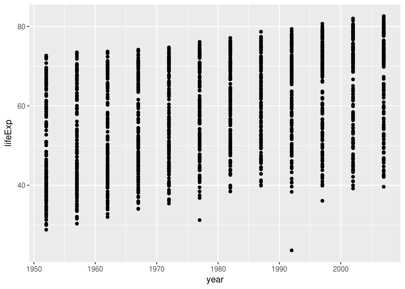
Try replacing geom_point() with geom_jitter() to deal with over-plotting.
How is life expectancy related to GDP per capita?
Bar Graph
What does the distribution of life expectancy look like?
ggplot(gapminder, aes(x = lifeExp)) +
    geom_histogram(binwidth = 1)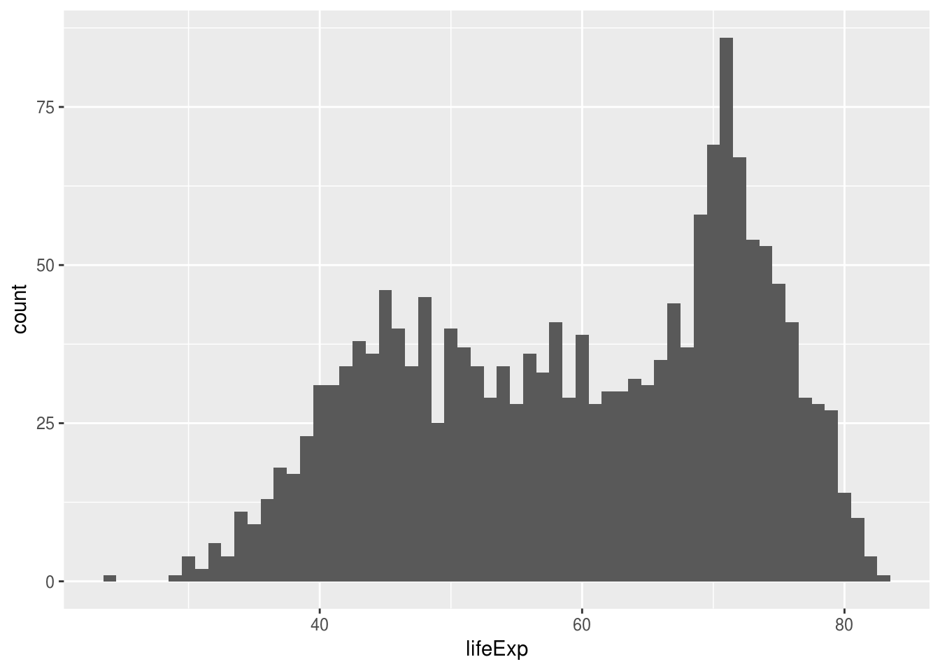
Try plotting a histogram of GDP per capita, gdpPercap.
Line Graph
How has life expectancy changed in Afghanistan over time?
library(dplyr)

afghanistan <- gapminder %>%
    filter(country == "Afghanistan")

ggplot(afghanistan, aes(x = year, y = lifeExp)) +
    geom_line()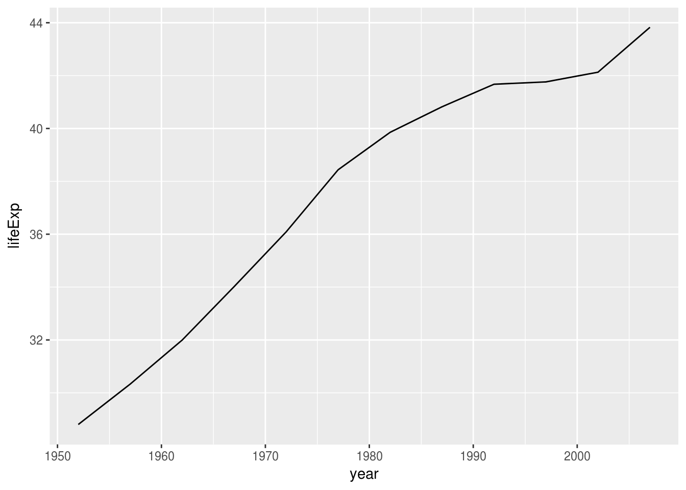
How has GDP per capita changed in Afghanistan over time?
Grouping
How has life expectancy changed in each country over time?
ggplot(gapminder, aes(x = year, y = lifeExp, group = country)) +
    geom_line()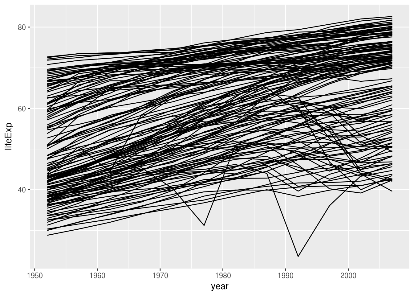
Faceting
Do these time trends differ between continents?
ggplot(gapminder, aes(x = year, y = lifeExp, group = country)) +
    geom_line() +
    facet_grid(. ~ continent)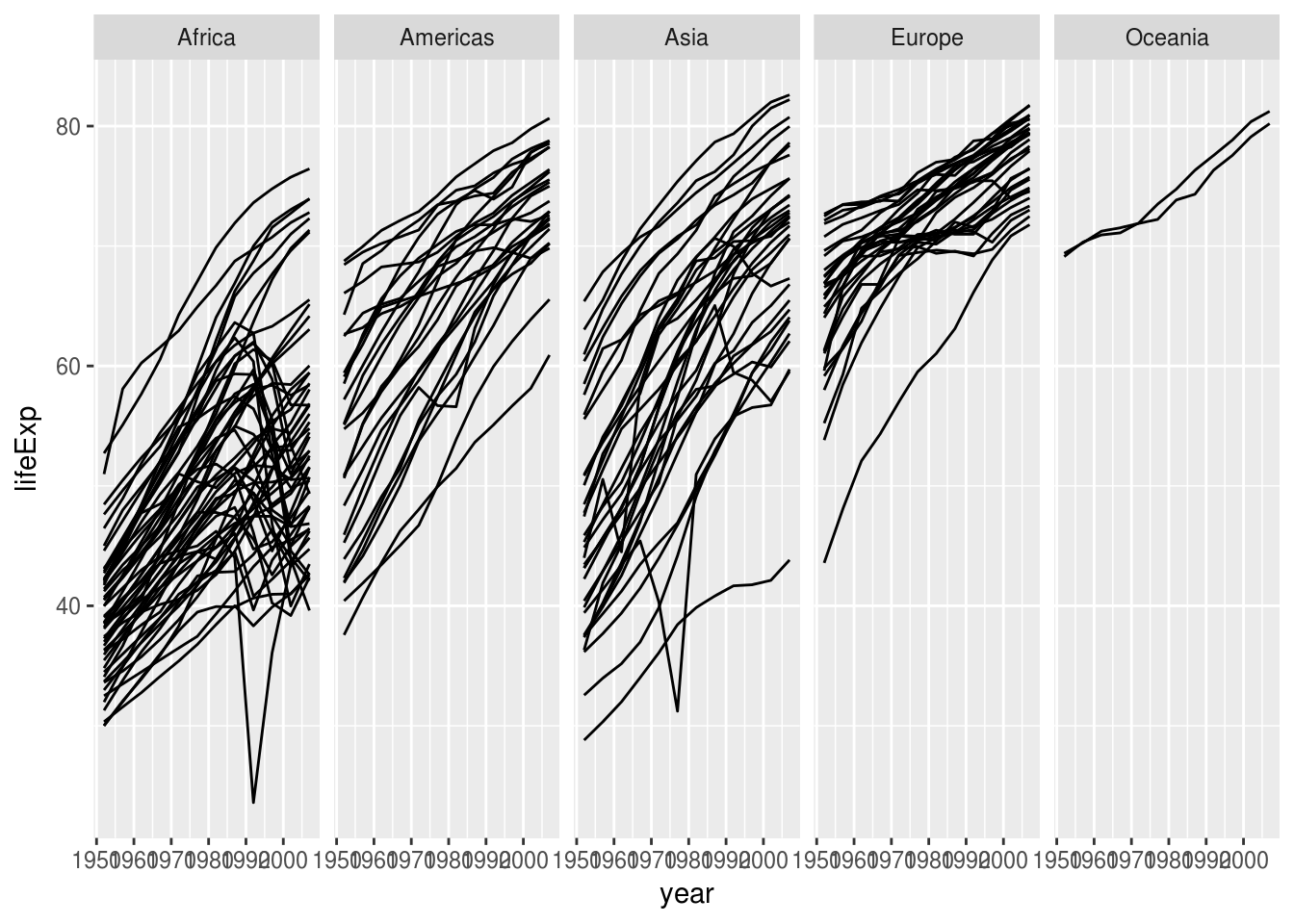
Do the trends for GDP per capita look similar?
Layering
Does the relationship between life expectancy and time look linear? The first layer in this graph shows all the data points, the second layer shows a smoothed trend line and confidence interval.
ggplot(gapminder, aes(x = year, y = lifeExp)) +
    geom_jitter(size = 0.5) +
    geom_smooth(method = "loess")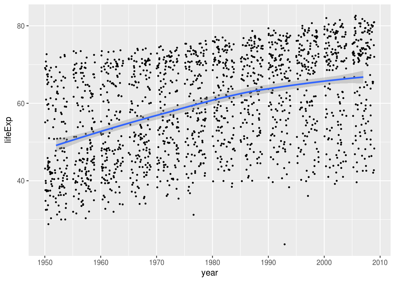
If you change the smoothing method from loess to lm, does the linear model look reasonable?
Density Plots
What does the joint distribution of GDP per capita and life expectancy look like?
ggplot(gapminder, aes(x = gdpPercap, y = lifeExp)) +
    geom_point(size = 0.25) +
    geom_density_2d() +
    scale_x_log10()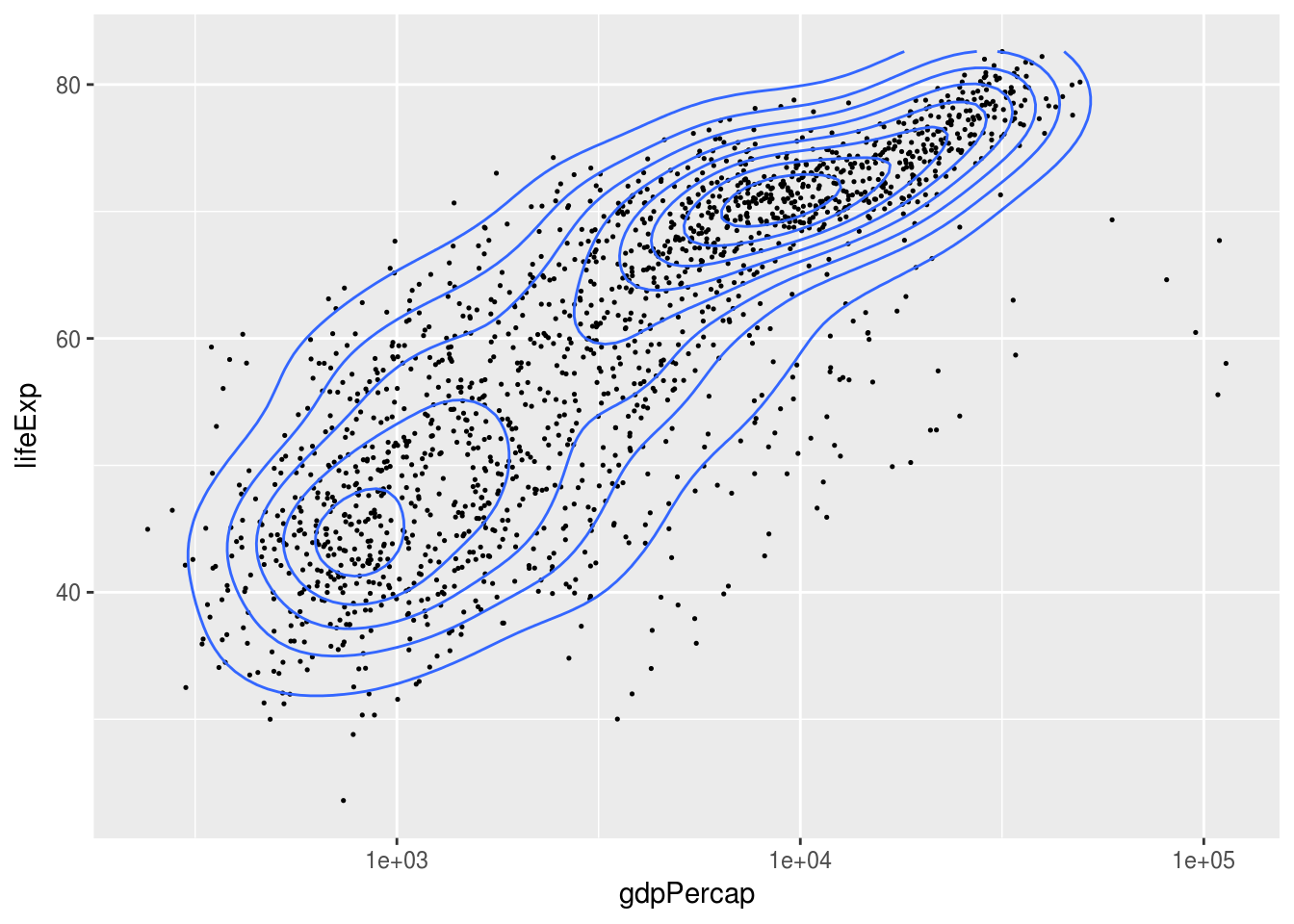
Does this relationship change over time?
Saving
There are a couple ways to save figures made with ggplot2.
The easiest way to save a graph is to export directly from the RStudio Plots panel, by clicking on Export when the image is plotted. This will give you the option of png or pdf and allow you to select the directory where you wish to save the file.
Alternatively the ggsave() function from the ggplot2 library is the way to go if you want to create files programmatically.
g <- ggplot(gapminder, aes(x = year, y = lifeExp)) +
    geom_point()

ggsave("example.pdf", g)
Try using ggsave() to create a file named gdpPercap.png that contains a bar chart of GDP per capita.
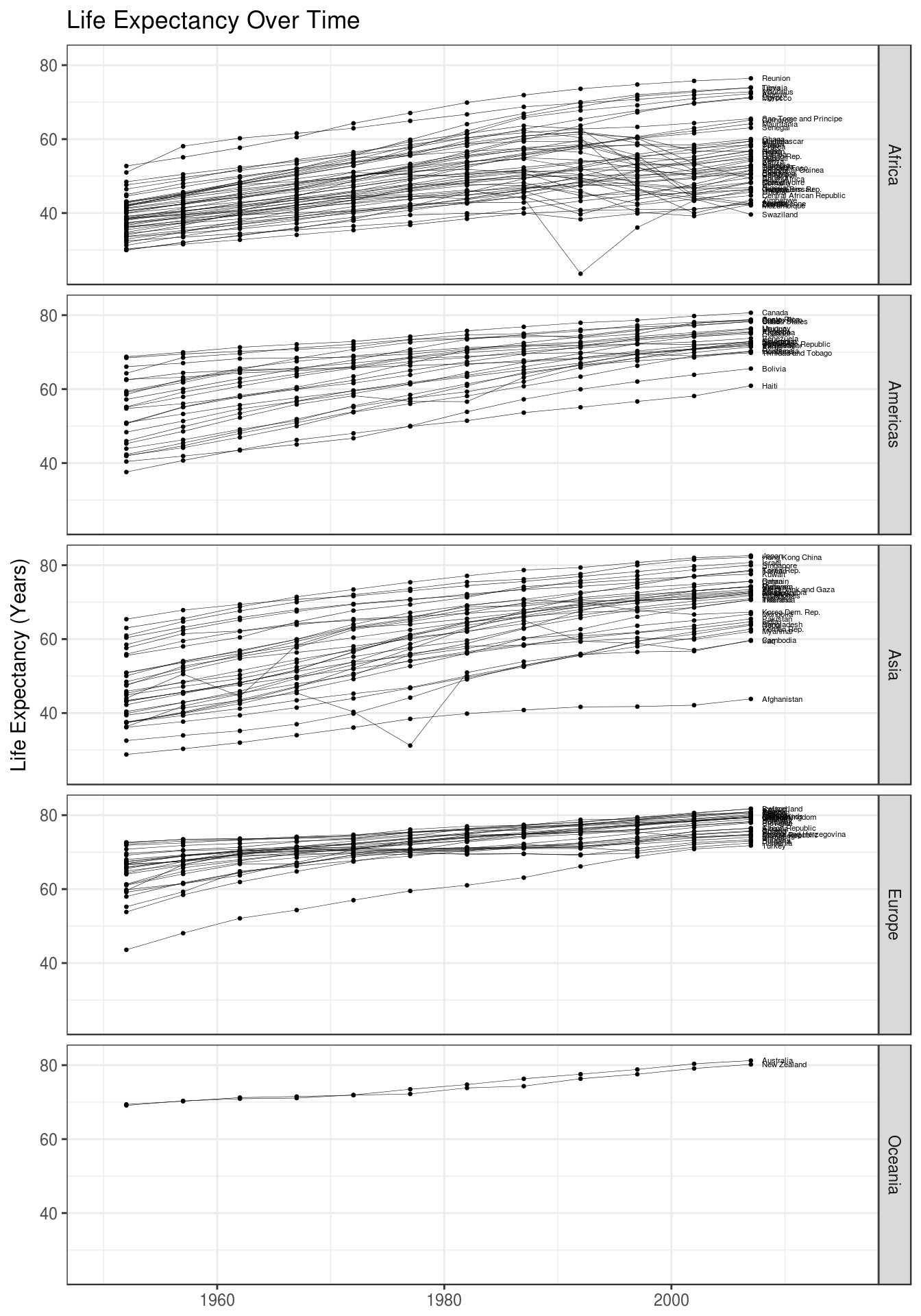
A Final Example
Below is an example to show off a bunch of ggplot2’s features at once. Notice that different layers in a plot can use different data (the text labels are created using a smaller set of data).
labels <- gapminder %>%
    filter(year == max(year))

ggplot(gapminder, aes(x = year, y = lifeExp, group = country)) +
    geom_point(size = 0.5) +
    geom_line(color = "black", size = 0.1) +
    geom_text(aes(x = year + 1, y = lifeExp, label = country), data = labels, hjust = "left", size = 1.5) +
    ggtitle("Life Expectancy Over Time") +
    xlab(NULL) +
    ylab("Life Expectancy (Years)") +
    facet_grid(continent ~ .) +
    xlim(1950, 2015) +
    theme_bw()